Experimental project

Todo
Core problem
The internet made learning accessible. It didn't make learning easy.
Today, almost anything can be learned online. YouTube has tutorials & demonstrations. Blogs have detailed explanations. Documentation provides technical knowledge. Communities share practical advice and real-world experience.
The problem is no longer finding information. It's knowing what to do with it.
"I want to learn Figma"
Role
Product Designer
Timeline
2 weeks
Tools used
Figma, Claude Code, Cursor

Opportunity
From information discovery to learning orchestration
The web already contains an enormous amount of knowledge. We need to make the knowledge that already exists work together. Learning is a step by step process and right now, the learner has to discover and connect each of these steps themselves. StudyKit does that for you.
the solution
A personalised learning path built from the best of the internet.
StudyKit turns an open-ended learning goal into a structured, personalised course built from the best resources across YouTube and the web. For example, if I want to learn Figma in 14 days,
01
I tell StudyKit my current skill level, what I want to achieve, and how much time I can commit each day.
02
AI breaks that goal into the skills I need - interface basics, layout, components, auto layout, prototyping, and design systems
03
Then finds relevant videos and articles, evaluates them, and arranges them into a day-by-day learning path.
04
Each day combines curated content with a practical exercise and a quick knowledge check, while a progress dashboard keeps me oriented toward the end goal.
scope
For the initial product, I would focus on proving one core loop:
Discover → Save → Plan → Customize → Collaborate → Book
For travellers
Connect Instagram and import travel saves
Save recommendations from creators, friends and other sources
Discover creator-made itineraries
Copy an entire itinerary
Build a trip from individual recommendations
Customize, replace, remove and reorder activities
AI-assisted day-by-day itinerary planning
Invite friends and collaboratively vote on plans
View estimated trip cost
Book through connected travel partners
Save inspirations for content creation at travel locations
For creators
Create and publish complete itineraries
Attach recommendations to individual places
See how many people saved, copied or booked their trips
Earn from bookings generated through their recommendations
defining the problem
four guiding principles
Everything in one place
Users should never wonder where something lives.
Built for growth
Adding new AI applications shouldn't increase complexity.
Reduce mental effort
The platform should organize complexity instead of exposing it.
Make systems understandable
Users should immediately understand how data, workflows and agents connect.
Making Sense of the System
Middleware isn't a simple product. It's an ecosystem. Before designing interfaces, I needed to understand how every piece connected.
Together with engineers, I mapped the relationships between
Only after understanding these relationships did the navigation begin to make sense.
explorations
The biggest challenge wasn't adding features. It was deciding how much complexity users should actually see. We explored several directions before landing on the final experience.

Why we moved on
Looked powerful but became overwhelming as systems grew.
Engineers found it hard to scan, manage and focus on one thing at a time.
Why we moved on
Too much navigation and too many levels.
Users often lost context when switching between sections and projects.

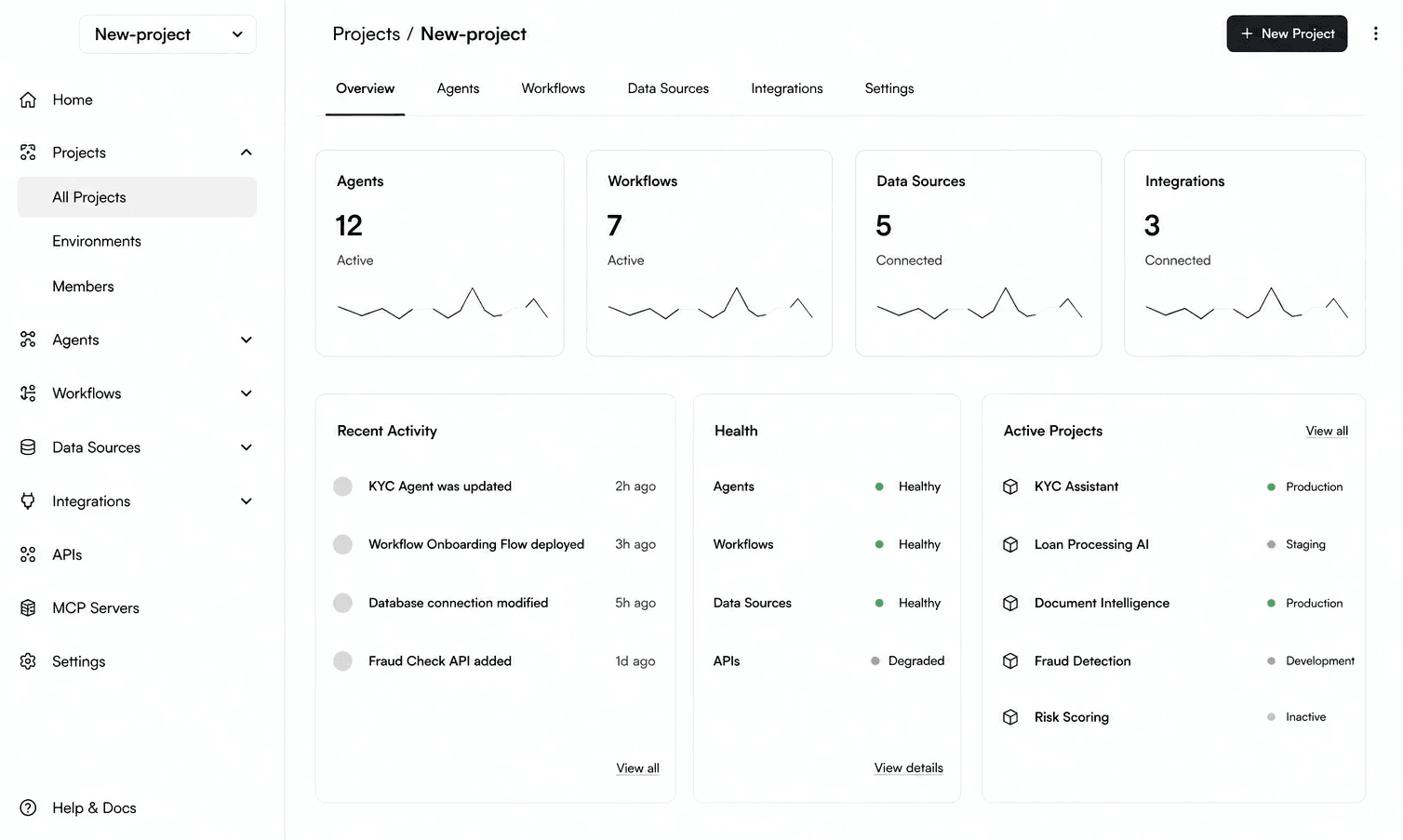
Why this direction
Balanced simplicity with control.
Project-first structure, clear sections and easy access to everything.
VISUAL DESIGN AND TONE
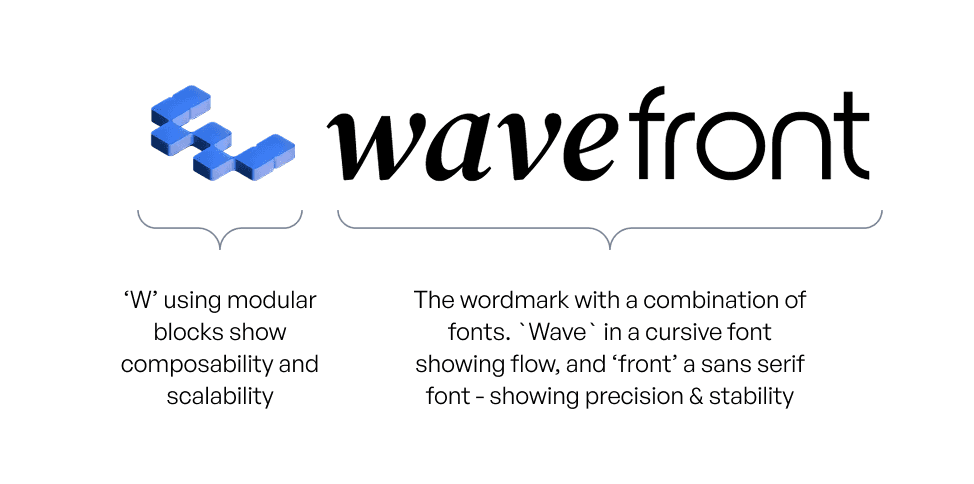
Logo design
The logo required to be simple but memorable. The design captures both movement (wave) and structure (blocks), which is the story of Wavefront: an elegant, living layer that’s also modular and composable.
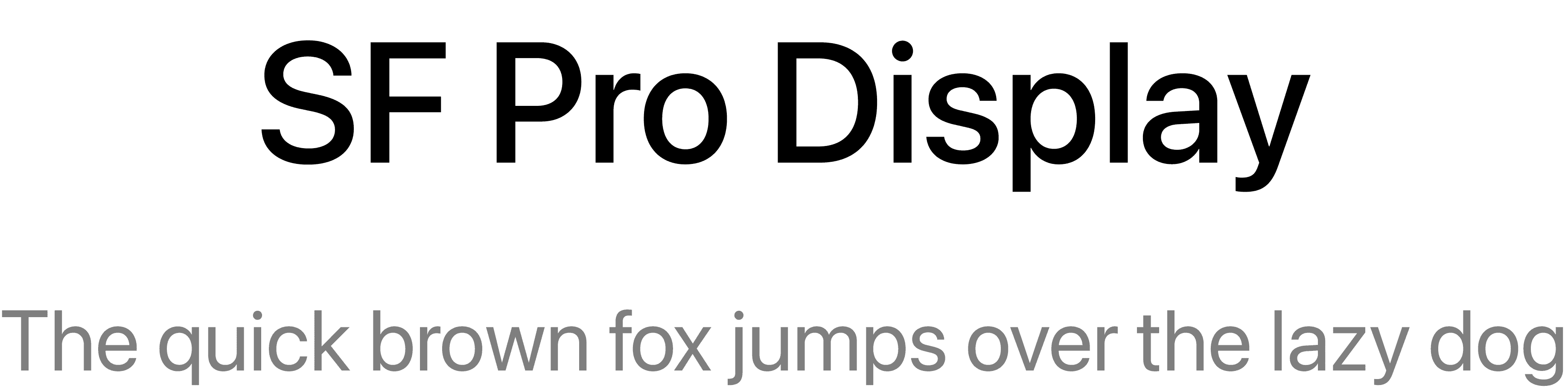
Typography
We needed a font with clean geometry and high legibility, allowing the interface to feel modern yet professional.
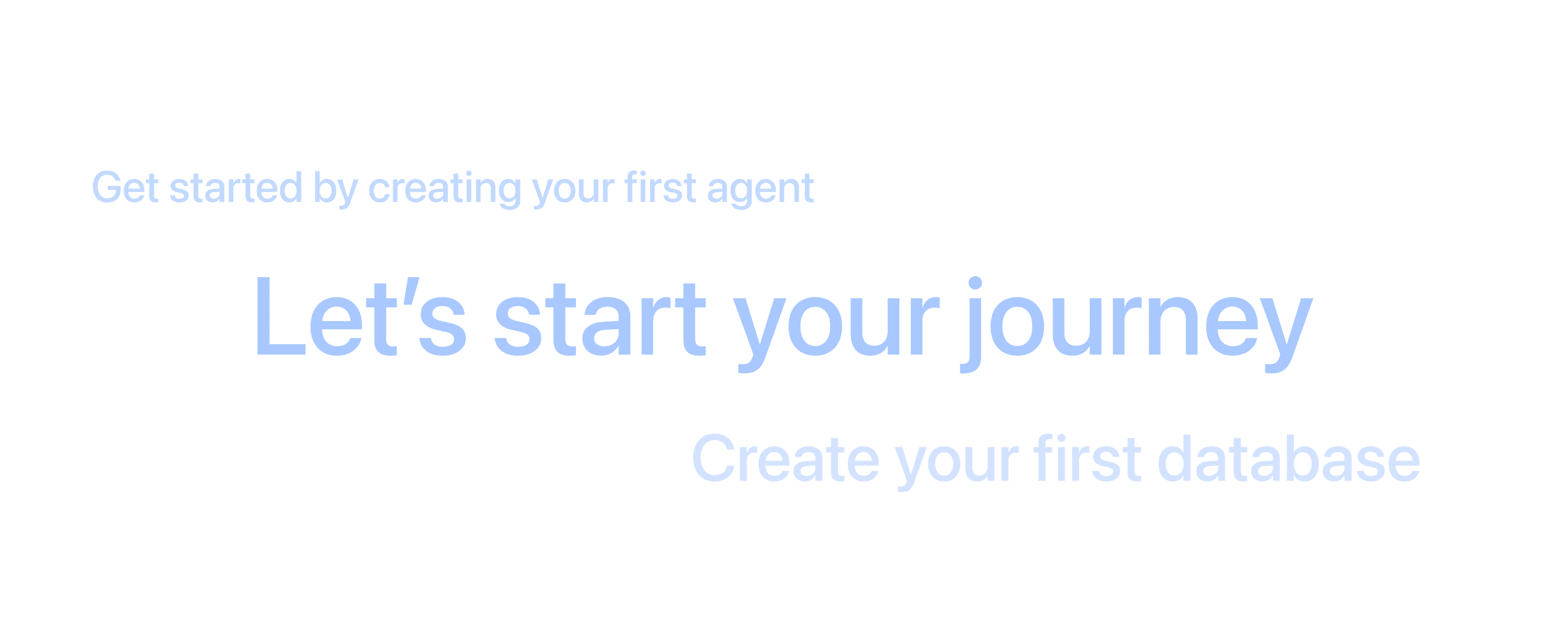
Microcopy
Simple, encouraging phrases like “Let’s start your journey” to make the platform feel approachable.

#101010
#FFFFFF
#FBFBFB
#CED1D6
Colour
A blend of white and soft gradients, maintaining light mode across platforms.
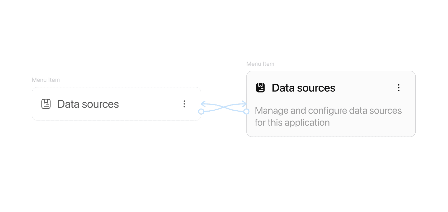
UI style
Follows a minimal style that prioritizes clarity and focus. Neutral tones and structured layouts make complex workflows feel approachable while maintaining a sense of technical precision.
Designing the Solution
App management dashboard
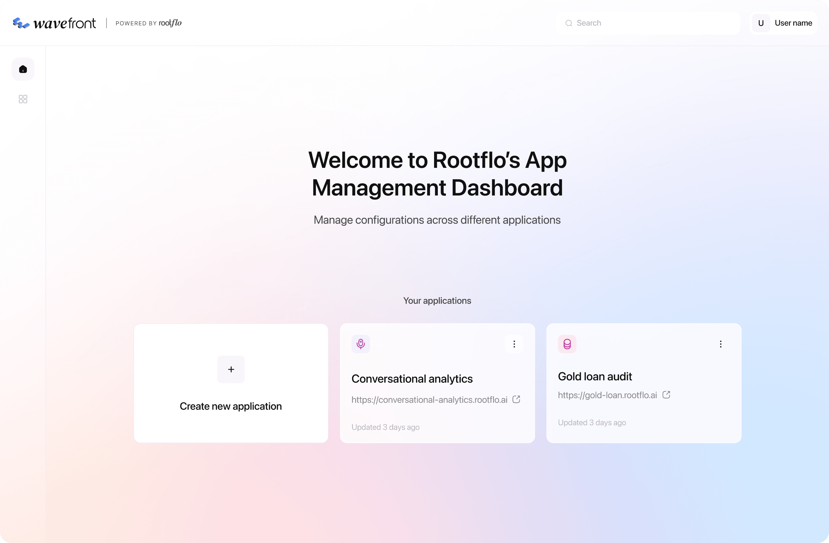
The first layer was the App Management Dashboard, the home screen for every user. It provided a simple overview of all applications within the ecosystem.
The dashboard featured:
A "Create new application" card for easy onboarding
Individual application tiles showing project names, links, and last updated timestamps
A calm gradient background that subtly differentiated this layer from the workspace, giving it a sense of clarity and freshness
Modular workspace
The interface was structured as a workspace - a flexible environment where users could create and manage different types of components
App creation
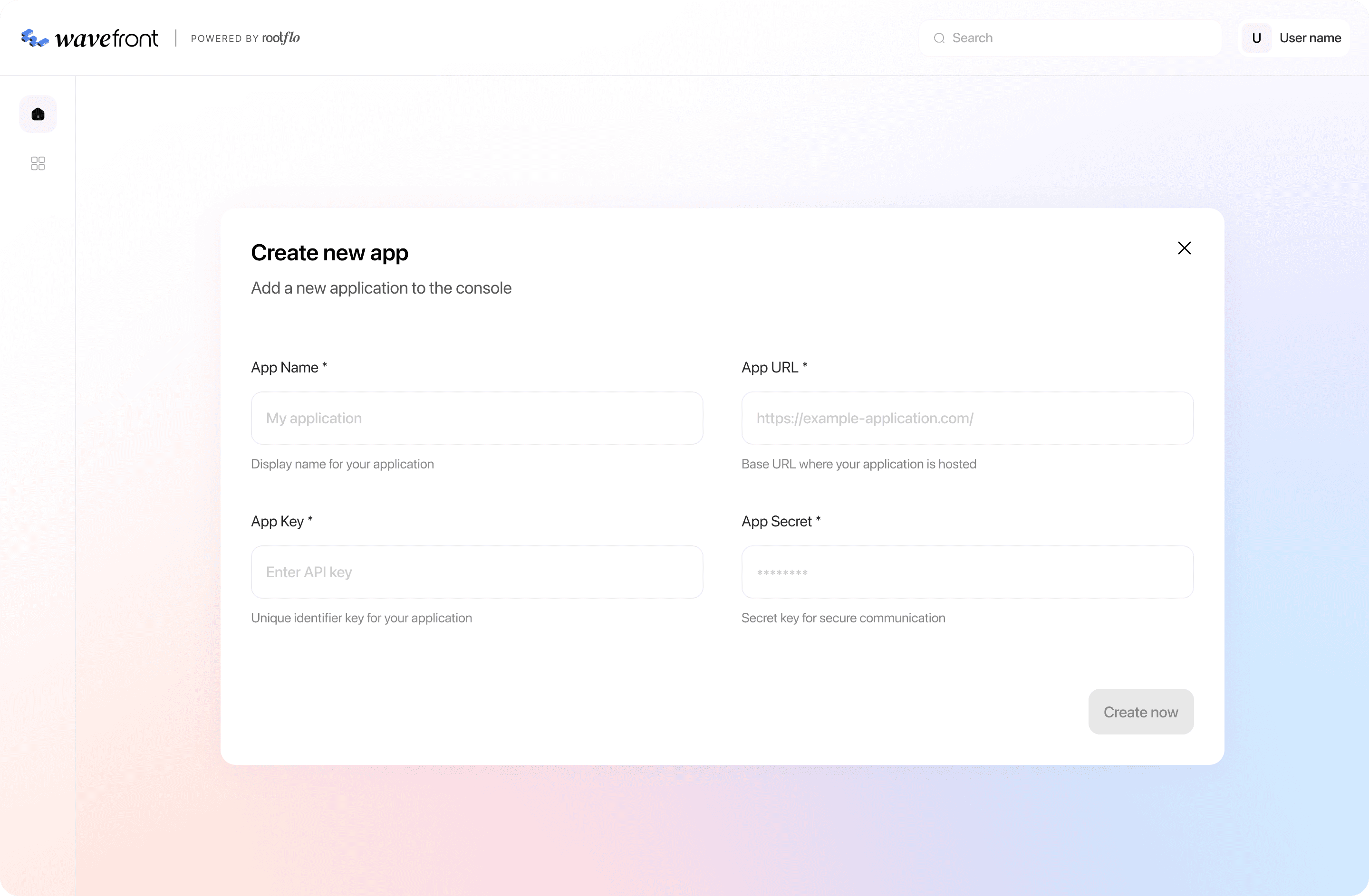
The "Create new app" popup keeps the form minimal and non-intimidating, focusing only on essential fields like app name, key, secret, and URL. Each input field is paired with helper text for guidance, ensuring technical clarity without overwhelming the user.
Home page for a new app
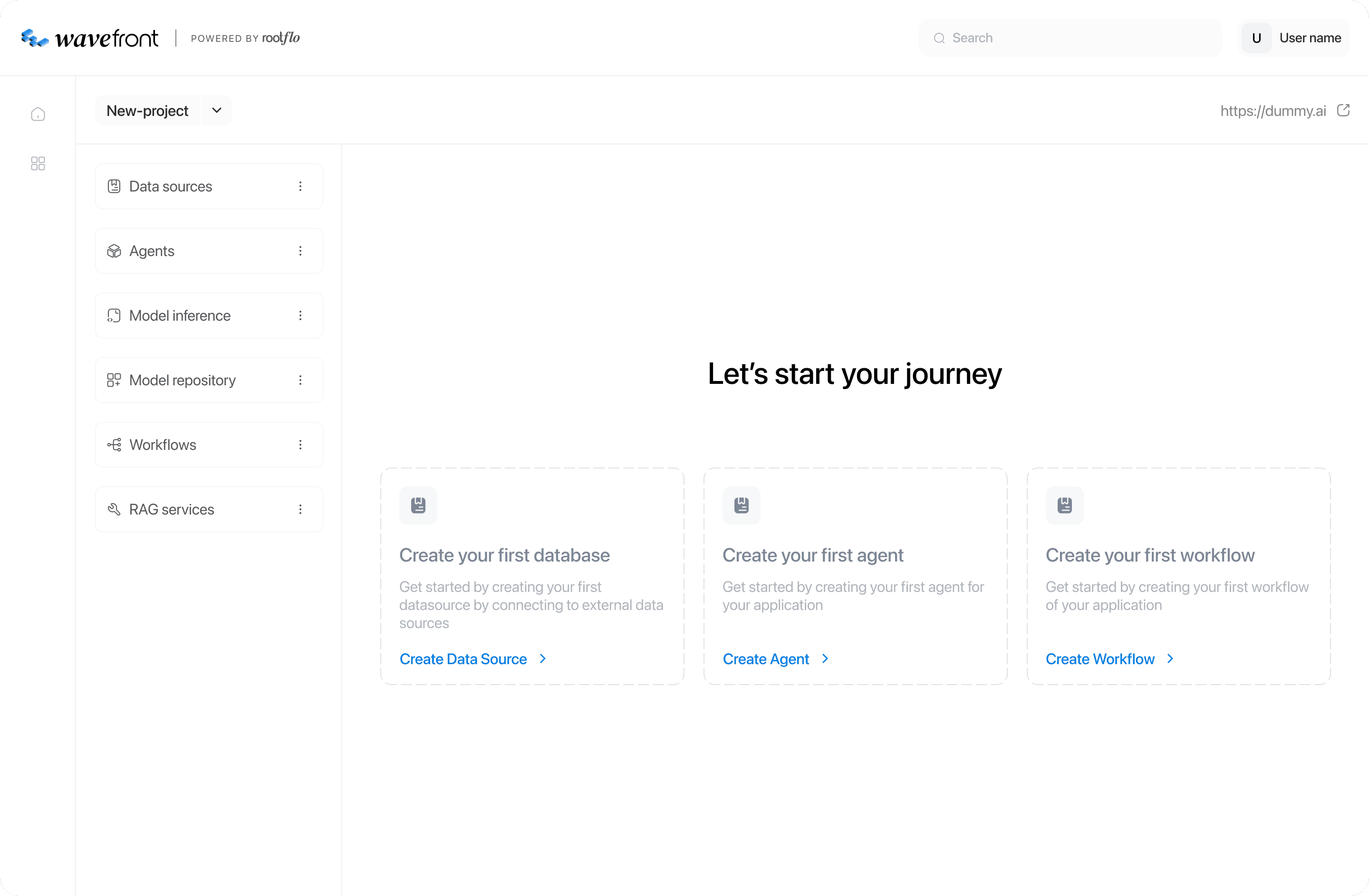
Once a new application is created, users land on an empty state that sets the tone for their workspace. The layout uses a friendly onboarding message - “Let’s start your journey” - paired with modular cards prompting the user to create their first database, agent, or workflow.
Empty state for tabs
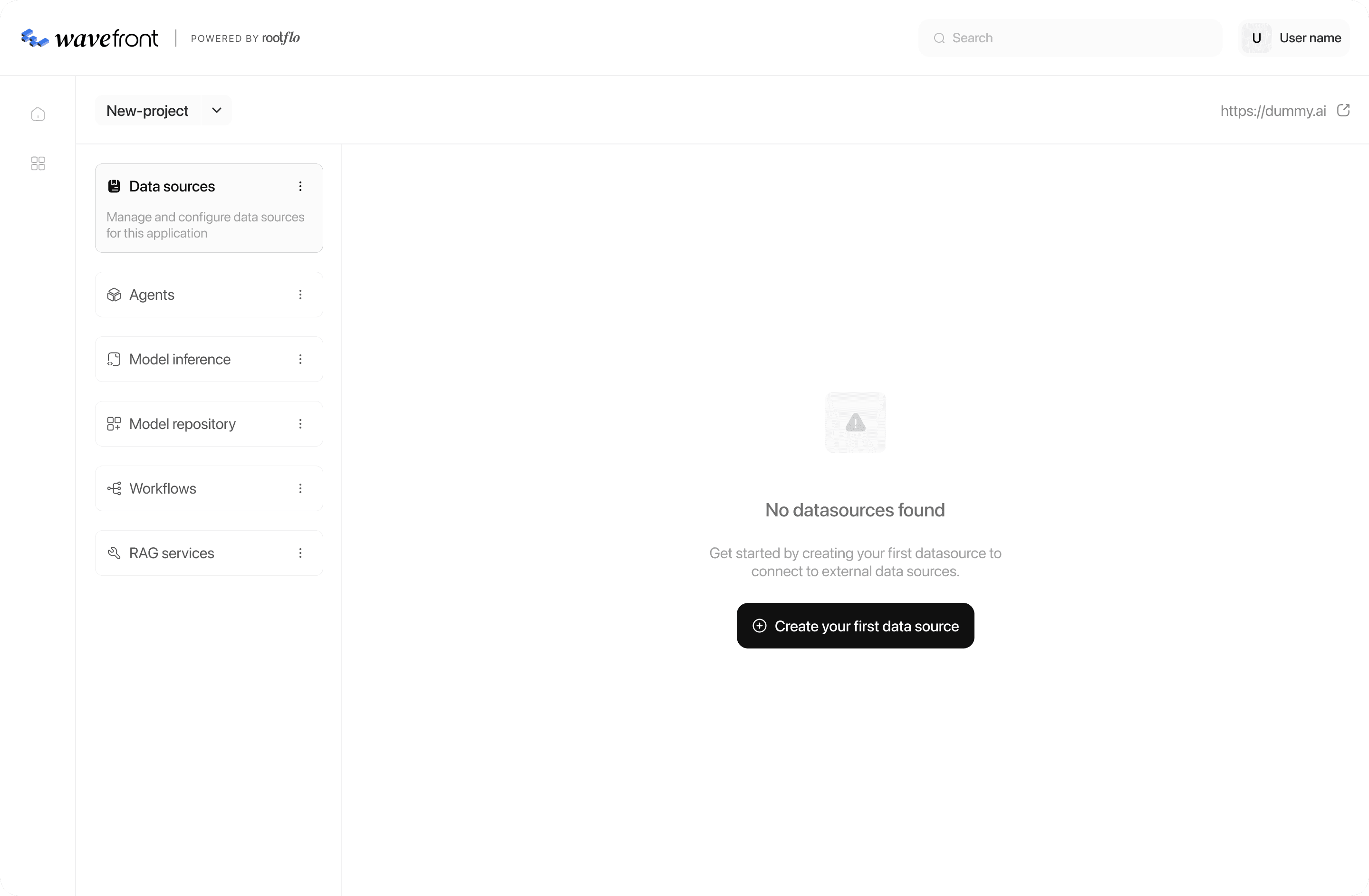
For each tab such as data sources, agents, or workflows, the empty state maintains a consistent structure. When no items exist, users see a minimal illustration and message that says “No *component* found,” followed by a single clear button to create one. This consistent approach reinforces predictability across modules.
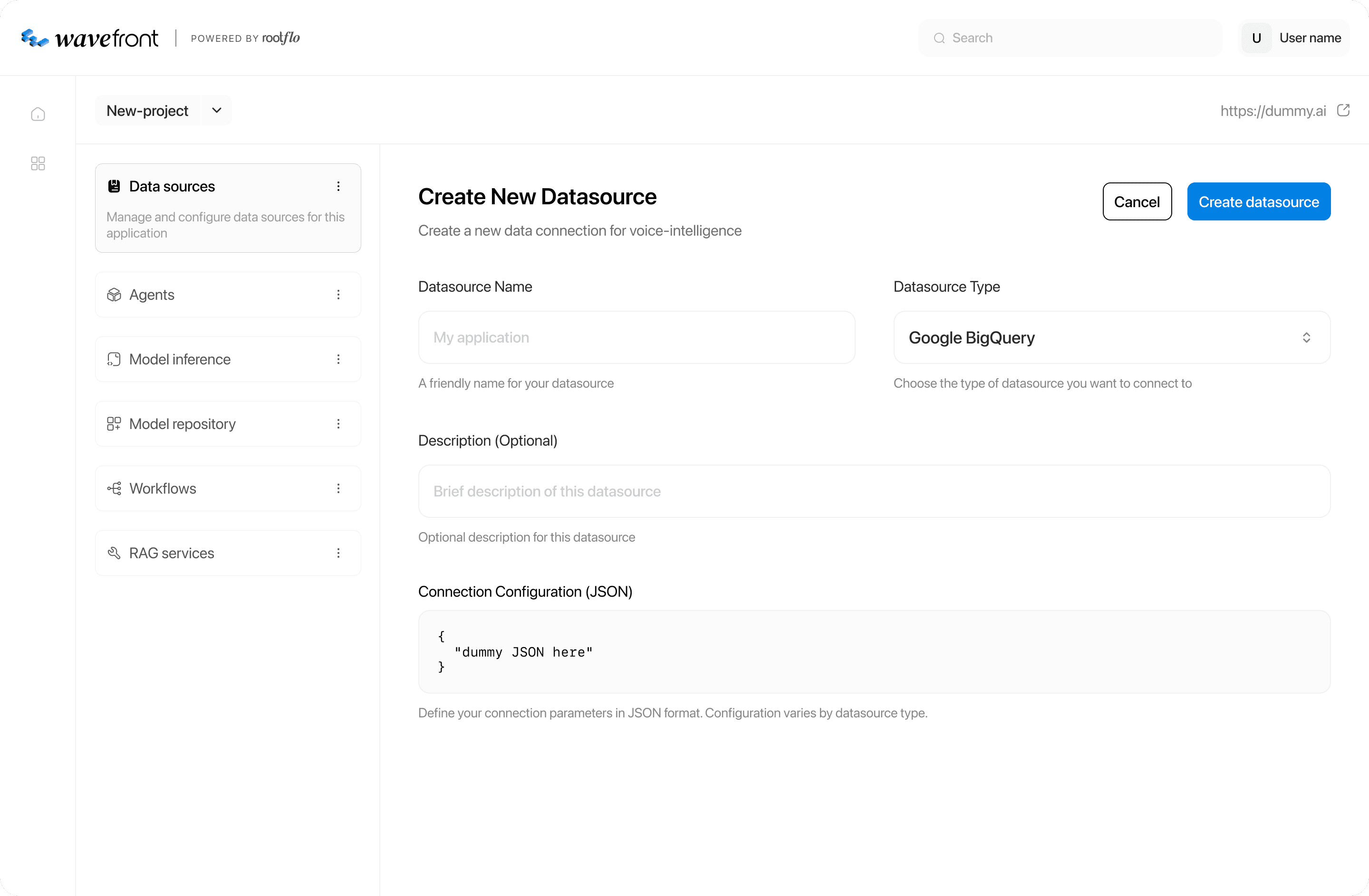
Creating a new component
When the user initiates a creation flow like adding a data source, the interface expands into a focused configuration screen. Form fields are organized into logical sections - general details, optional description, and connection configuration.
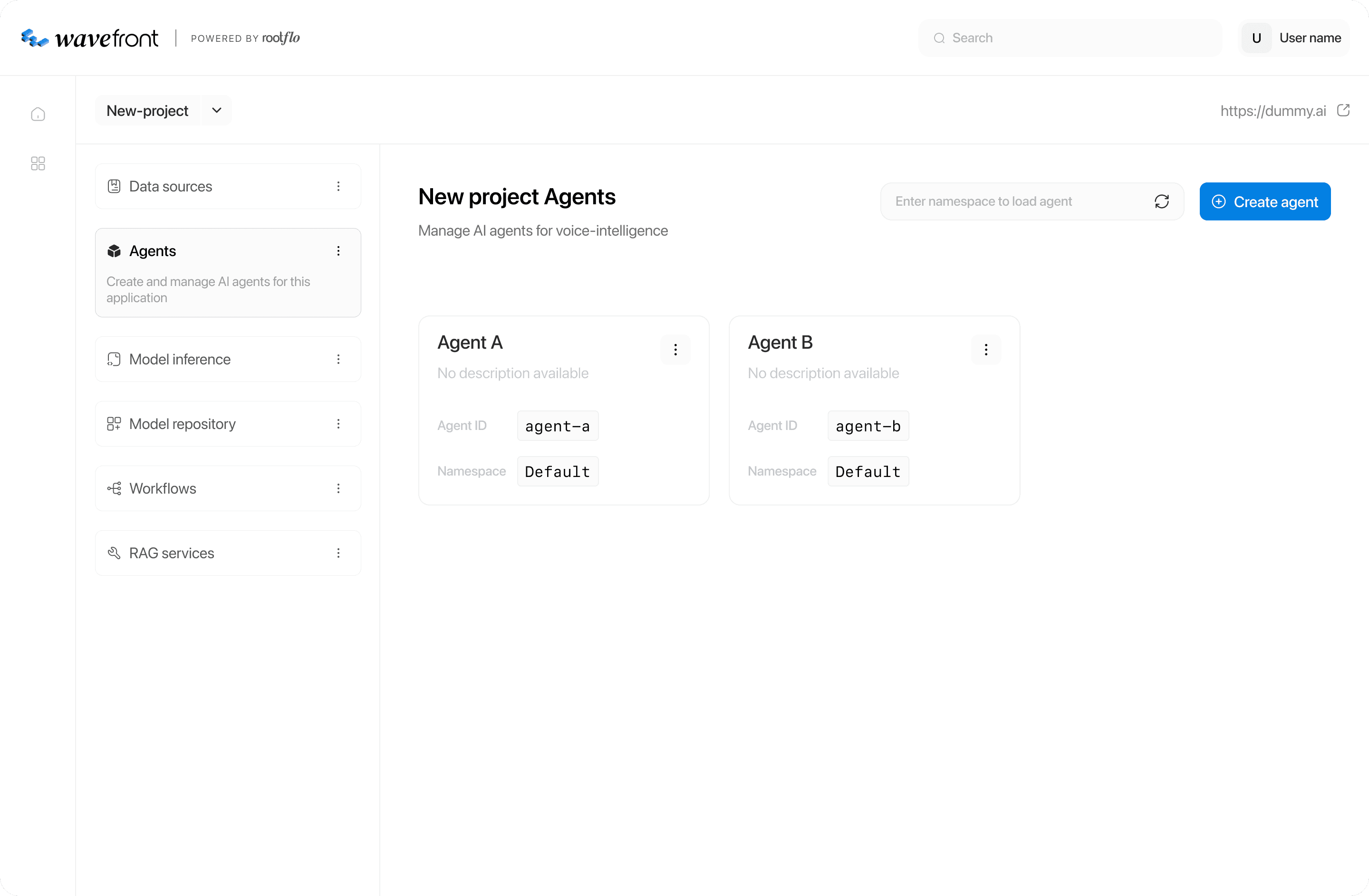
Created components listing
Details of a component
LEARNINGS
Designing internal tools taught me that every little detail needs a purpose. Working on the middleware platform meant building for totally different kinds of people - developers, data teams, and business folks - all using the same system in their own way.
I learned how to make screens that go deep technically without feeling overwhelming, and how modular design can keep even complicated workflows flexible as they grow. But the biggest lesson? Clarity beats fancy visuals. The best design choices were the ones that made someone’s day easier, faster, and so smooth they barely noticed the tool at all.