
Shipped
Wavefront is an open-source middleware platform designed to seamlessly integrate AI-driven agents, workflows, and data sources across enterprise environments. It acts as a connective layer that bridges modular frontend applications with complex backend data pipelines.
This project focused on designing an interface that balanced scalability with simplicity. The result was a foundation that made AI system management intuitive, transparent, and ready for enterprise deployment.

Skills
Interface design, User experience design
Timeline
2 weeks
Team


CONTEXT
The goal was to design an internal builder and dashboard where teams could manage data sources, agents, models, and workflows - all in one place. The tool needed to be simple enough for non-technical users to navigate, yet powerful enough for developers to build complex connections between systems.
My role as the designer was to define the end-to-end interface UI, ensuring the interface felt modular, scalable, and intuitive for every type of user.
PROBLEM
Before the middleware tool, every AI project required separate setups, multiple dashboards, and manual configuration.
This led to:
Fragmented project management
Repetitive configuration work across teams
Difficulty tracking dependencies and workflow health
We needed to bring everything together into one clear, visual management system that could scale as Rootflo’s AI ecosystem expanded.
DESIGN OBJECTIVES
✨
Create a unified workspace for all AI applications
⚙️
Simplify the setup and configuration process
👀
Enable visibility across projects, workflows and data sources
🧩
Design for modularity — every part of the system should feel connected but independent
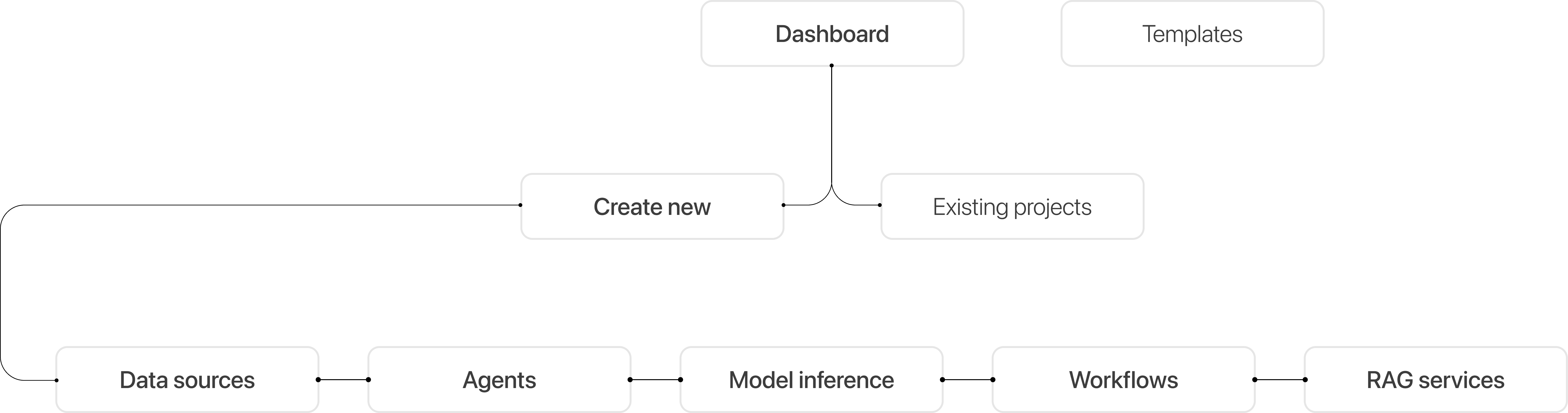
NAVIGATION AND INFORMATION HIERARCHY
To maintain a clear flow, navigation was split into two levels:
Global navigation - Home page with the existing projects and button to create new application
Sub navigation - Inside the create application tool with data sources, agents, models and the workflows to tie everything together
VISUAL DESIGN AND TONE
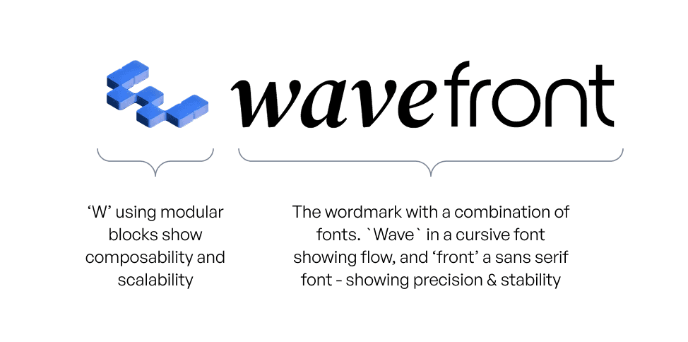
Logo design
The logo required to be simple but memorable. The design captures both movement (wave) and structure (blocks), which is the story of Wavefront: an elegant, living layer that’s also modular and composable.
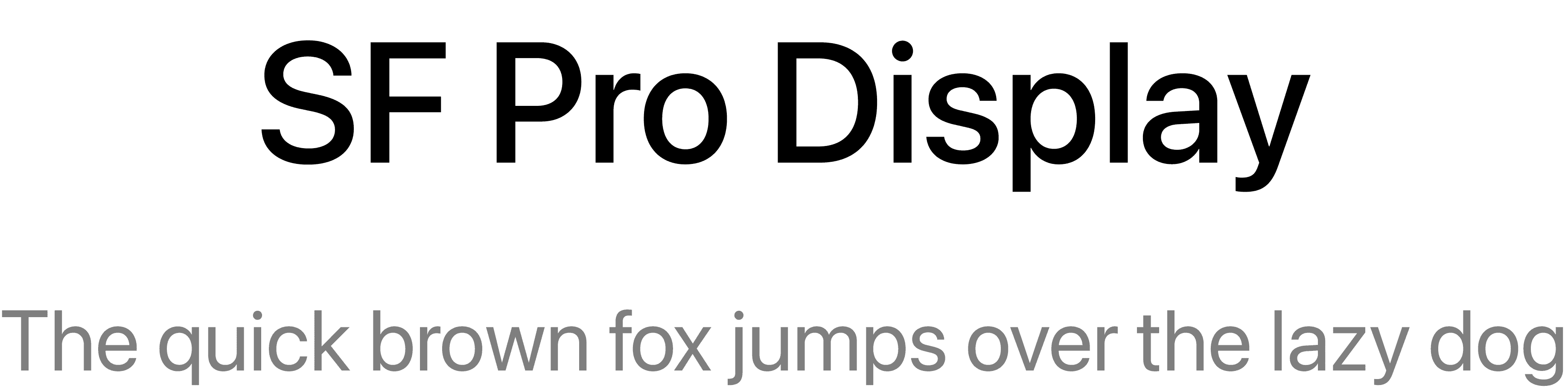
Typography
We needed a font with clean geometry and high legibility, allowing the interface to feel modern yet professional.
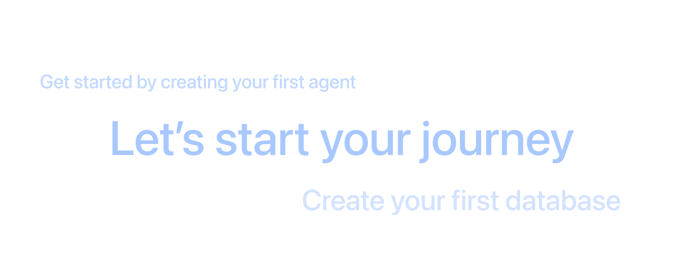
Microcopy
Simple, encouraging phrases like “Let’s start your journey” to make the platform feel approachable.

#101010
#FFFFFF
#FBFBFB
#CED1D6
Colour
A blend of white and soft gradients, maintaining light mode across platforms.
UI style
Follows a minimal style that prioritizes clarity and focus. Neutral tones and structured layouts make complex workflows feel approachable while maintaining a sense of technical precision.
INTERFACE DESIGN
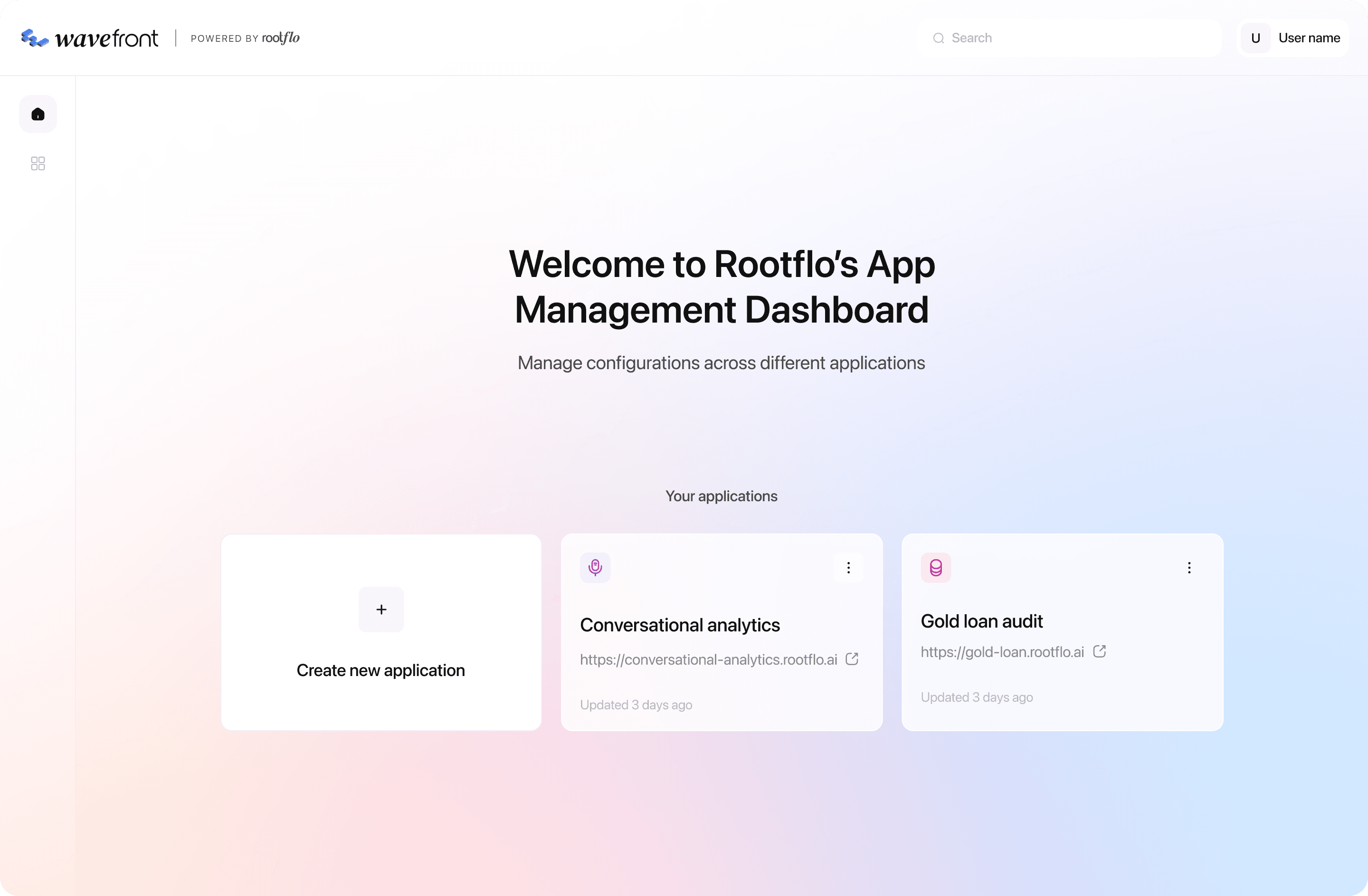
App management dashboard
The first layer was the App Management Dashboard, the home screen for every user. It provided a simple overview of all applications within the ecosystem.
The dashboard featured:
A "Create new application" card for easy onboarding
Individual application tiles showing project names, links, and last updated timestamps
A calm gradient background that subtly differentiated this layer from the workspace, giving it a sense of clarity and freshness
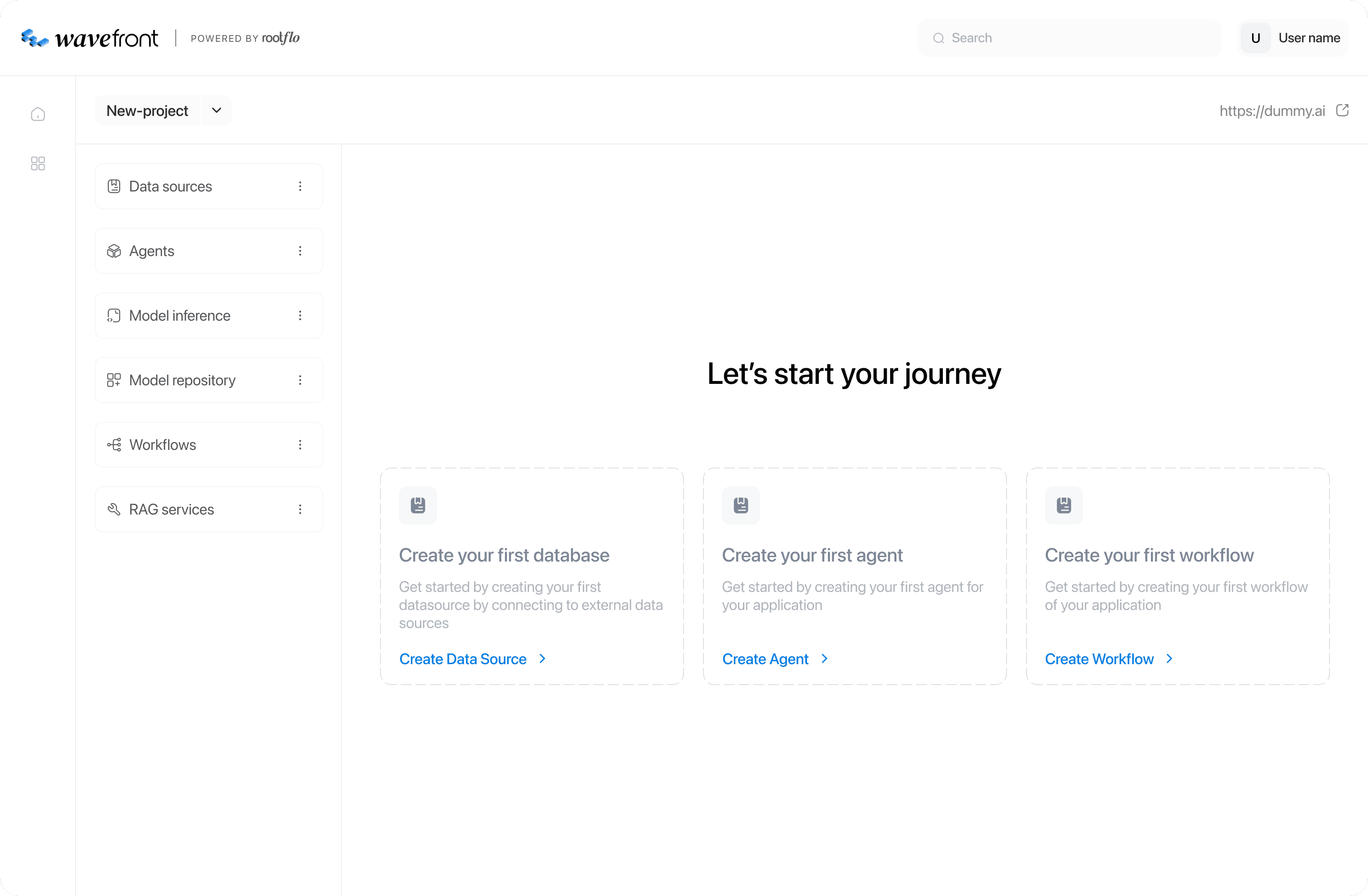
Modular workspace
The interface was structured as a workspace - a flexible environment where users could create and manage different types of components
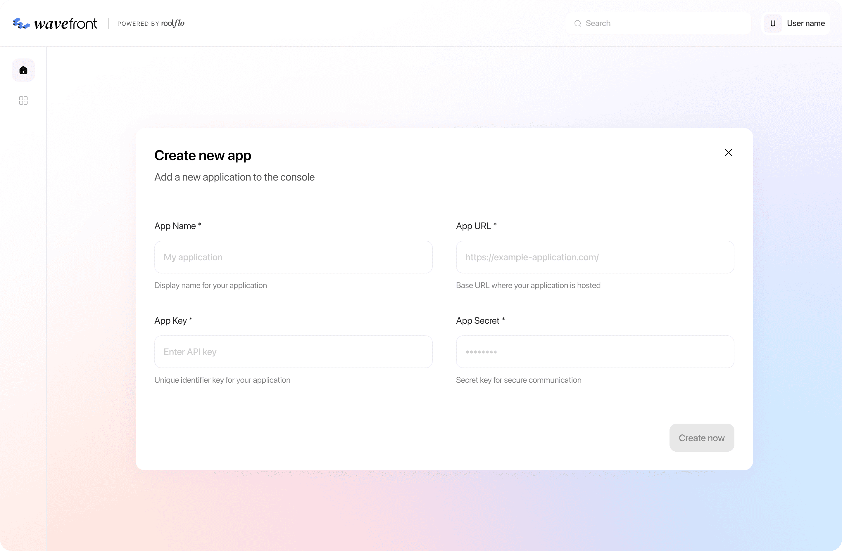
App creation
Home page for a new app
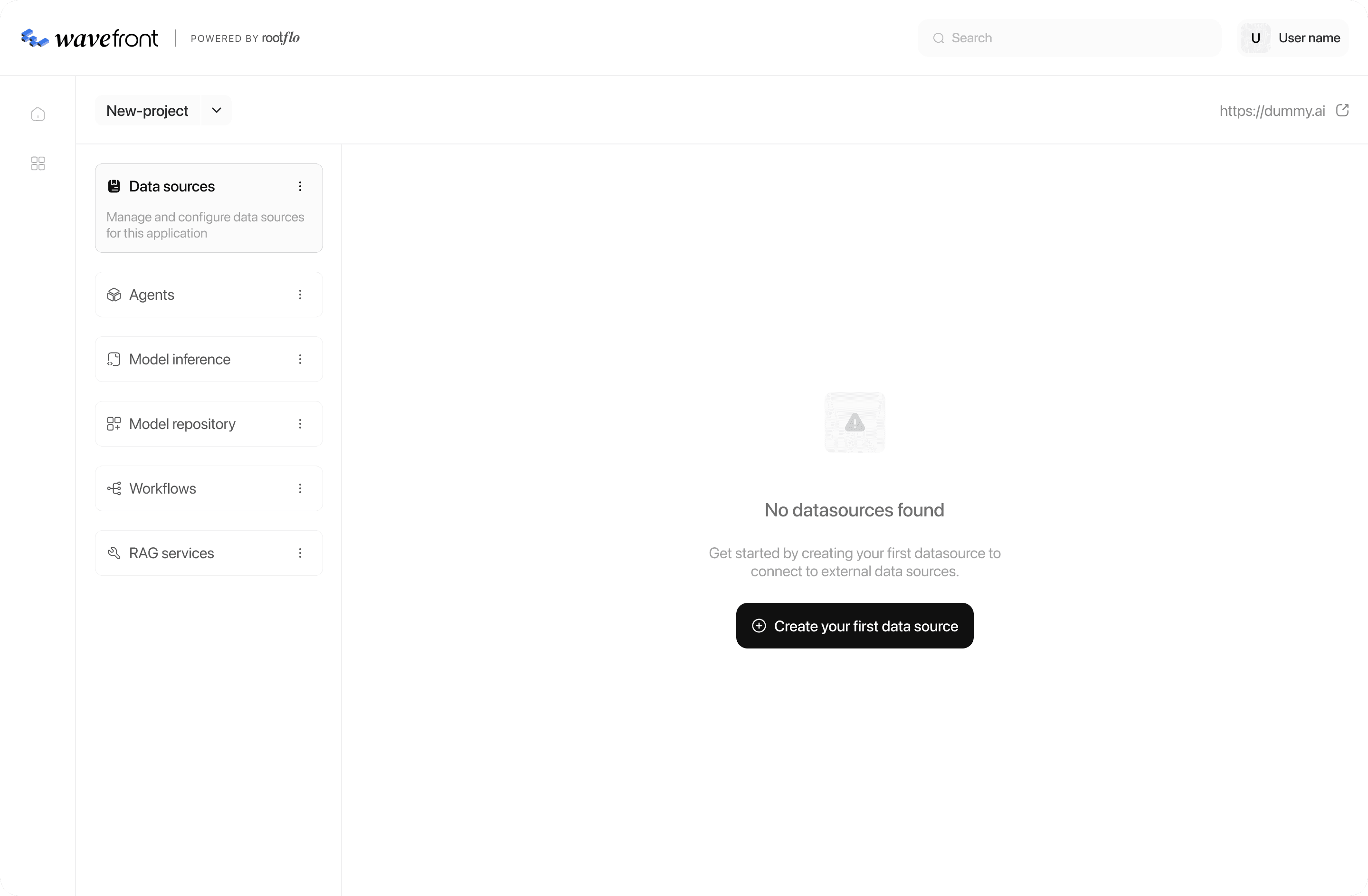
Empty state for tabs
Creating a new component
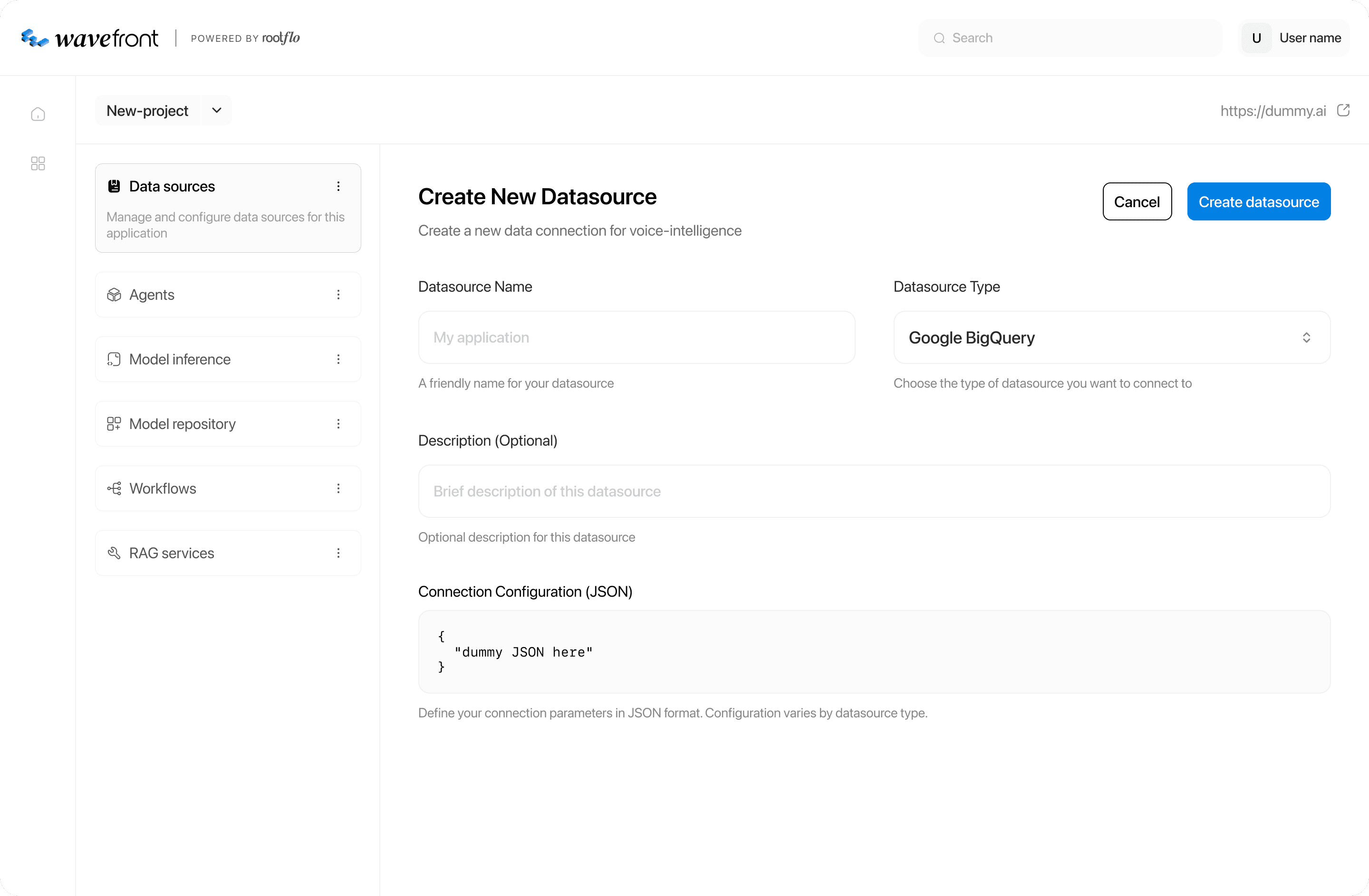
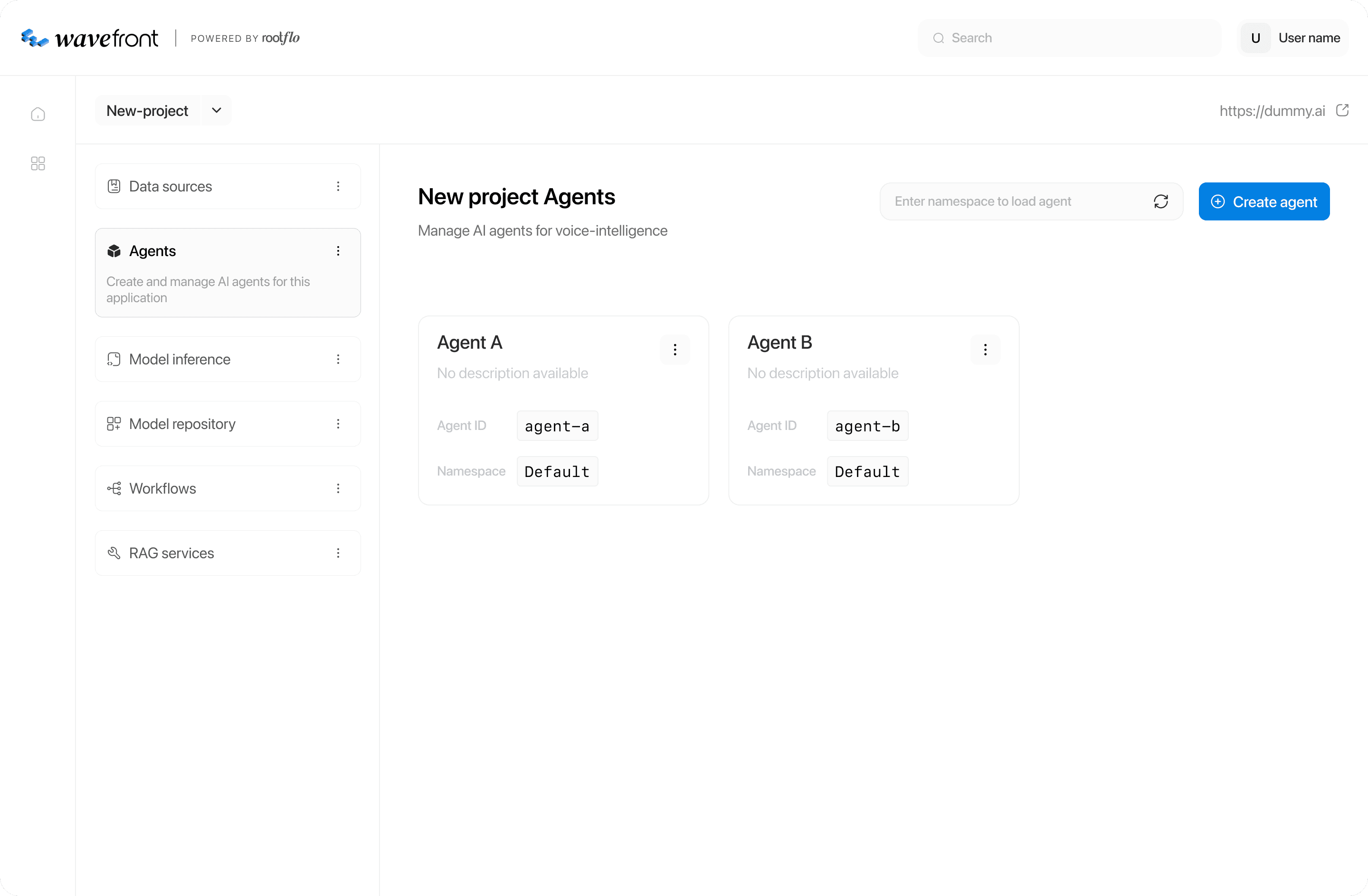
Created components listing
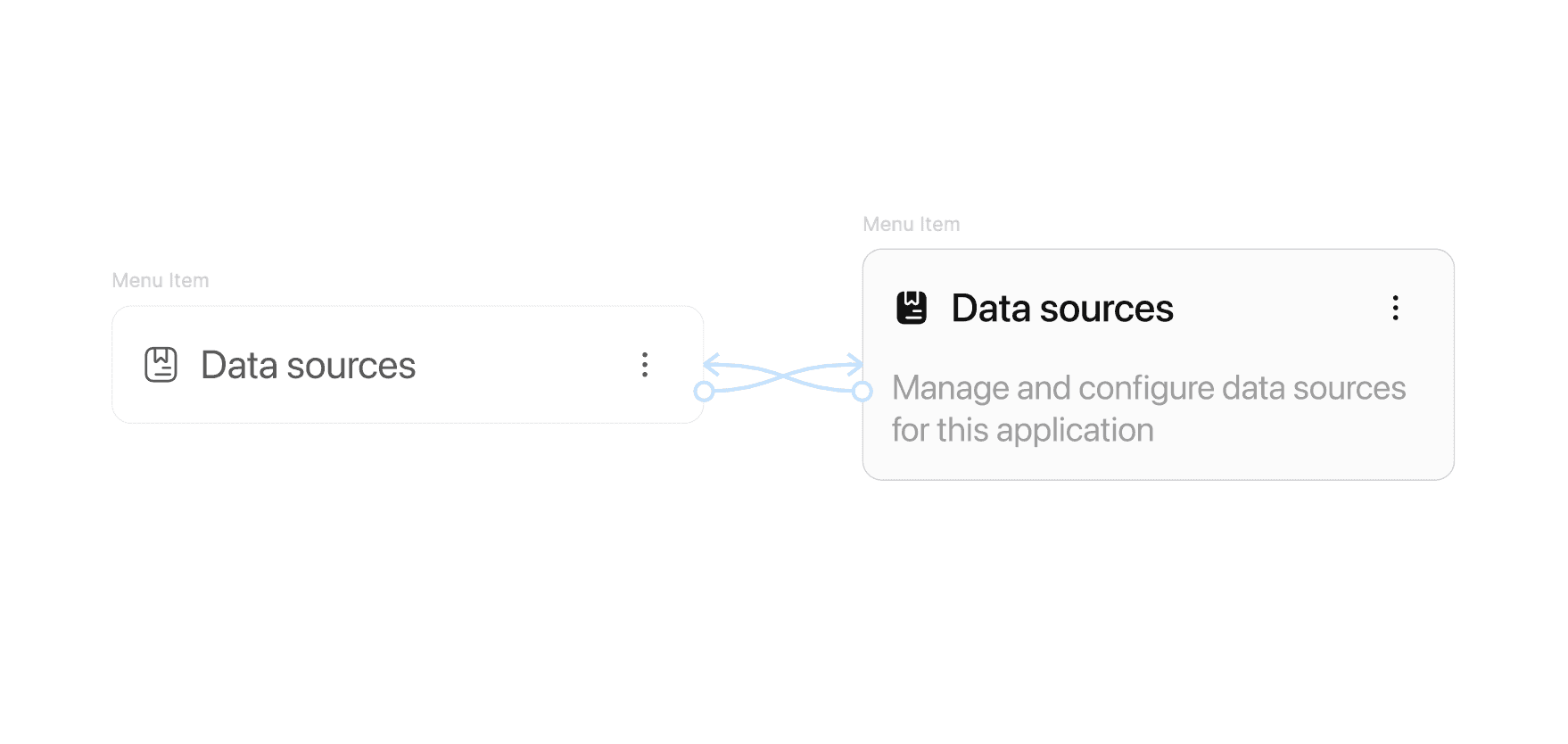
Details of a component
LEARNINGS
Designing internal tools taught me that every little detail needs a purpose. Working on the middleware platform meant building for totally different kinds of people - developers, data teams, and business folks - all using the same system in their own way.
I learned how to make screens that go deep technically without feeling overwhelming, and how modular design can keep even complicated workflows flexible as they grow. But the biggest lesson? Clarity beats fancy visuals. The best design choices were the ones that made someone’s day easier, faster, and so smooth they barely noticed the tool at all.